Parents planning a playroom repaint are being encouraged to think first about light, room size and how the space will be used, rather than choosing bright colours across every wall.
Tash Bradley, a trained colour psychologist and director of interior design at paint company Lick, has set out how she approached the playroom she created for her two-year-old son, Zac. Her example offers practical guidance for households trying to make a child’s room feel engaging while keeping it calm enough for everyday family use.
The project centred on a north-facing room, which meant the space received limited natural light, particularly during colder months. Instead of trying to disguise that problem with strong colour on every surface, Bradley used a warm white across the walls, cupboards and woodwork to help the room feel lighter and less cold.
She chose Lick White 05 as the main base colour, citing its warm yellow undertones. In practical terms, that approach can help households dealing with darker rooms, as warmer whites are often less stark than cooler whites and can soften spaces that do not benefit from direct sunlight.
The more colourful elements were used in smaller, controlled areas. Bradley painted the ceiling in a soft blue, Blue 15, to give the room a more open feeling. She has said the choice was intended to create an impression of sky above the child’s play space, while avoiding the need for a fully blue room.
For parents, that is a useful point. A ceiling can be a lower risk place to introduce colour, particularly in a room filled with toys, books and furniture that already add visual activity. It can also make a room feel more considered without increasing clutter or requiring costly changes to fittings.
A small red accent was also used on the windowsill. Bradley chose Red 03 for this detail, describing it as a way to bring in a playful primary colour without allowing it to dominate the room. For households working to a budget, this type of small paint feature can be a practical compromise, as it uses less paint and can be changed more easily than a full wall.
The wider lesson from the project is that children’s rooms do not need to rely on strong colour everywhere to feel cheerful. A warm neutral base can make toys, storage baskets, play furniture and books stand out naturally. It can also make the space easier to adapt as a child grows and their interests change.
Lighting is an important part of that decision. North-facing rooms in UK homes can often feel cooler because they receive less direct sun. In those spaces, very cool whites, greys or blue-toned neutrals may make a room feel flatter. Warmer shades can help offset that, though decorators should still test samples at different times of day before committing to a full room.
Bradley is now planning a second playroom as her family prepares to move from London to the Somerset countryside. She has said she intends to keep the same broad principle of a room that supports creativity without feeling overstimulating, but expects to use colour more confidently through furniture, joinery and colour-blocking rather than relying only on the walls.
Her next scheme is being influenced by one of her son’s favourite books, Mouse on the River, particularly its soft blues and greens. She has linked that palette to the setting of the new home, where the playroom will overlook the garden and trees.
Bradley has indicated that she is considering an analogous palette, meaning colours that sit close together on the colour wheel. In this case, that would include soft blues and greens, with a possible olive tone. Such combinations are often used to create a more settled background because the colours have a close relationship, rather than a sharp contrast.
She is also considering a richer burnt orange as an accent through furniture or accessories. That approach gives households another practical option: adding stronger colour through pieces that can be moved, repainted or replaced, rather than making permanent or expensive changes to the whole room.
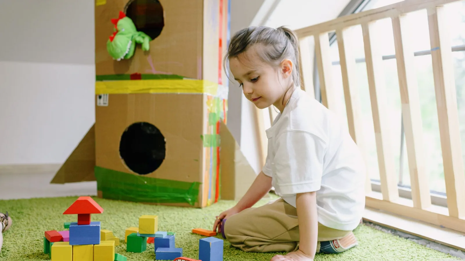
Storage remains a key part of any playroom plan. While the source scheme includes decorative choices, the practical need is straightforward: toys, craft materials and books need a clear place to go. Painted furniture, baskets and low cupboards can introduce colour while also keeping the space usable.
For families planning similar work, the main takeaway is to start with the conditions of the room. A darker space may benefit from a warm base colour, while brighter rooms may tolerate stronger shades. Accent areas such as ceilings, windowsills, shelving or furniture can add interest without making the room feel busy.
A playroom has to work for both children and adults. Bradley’s approach shows how careful paint choices can make a room feel brighter and more inviting while keeping costs and future changes under control. For households redecorating, the most practical route is to use colour where it has purpose, test it in the actual light of the room, and leave enough flexibility for the space to change as the child grows.