
A wave of 2026 colour-of-the-year announcements has settled on the same message for homes: step away from high-chroma statements and lean into warmth. Paint and design companies have highlighted palettes described as earthy, classic, retro, and neutral — a cluster of tones that read as warm, comforting, and subdued. The shift carries weight beyond studio mood boards. It often shapes what landlords consider for rental refreshes, what small contractors get asked to apply on walls and woodwork, and how homeowners plan winter-to-spring repainting. After years when cool greys featured widely across new builds and refurbishments, this turn towards softer, sunlit undertones signals a notable mood in domestic spaces: calm, familiar, and easy to live with.
Announced across industry channels in January 2026, the shared direction points to a coordinated season ahead for interiors. The emphasis on warmth centres everyday maintenance decisions as much as showroom displays, affecting colour cards, sample pots, and the palettes that guide repainting schedules.
Warm neutrals take centre stage in 2026
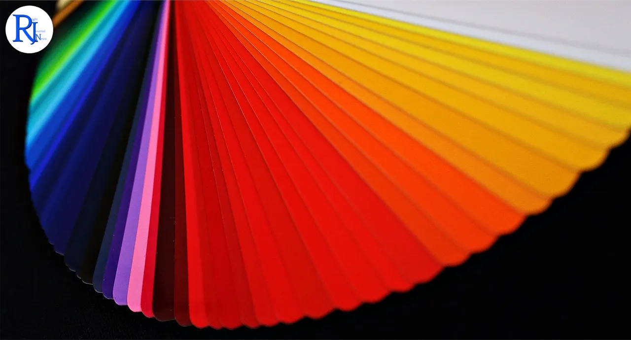
A clear through-line links this year’s picks: designers and paint houses are presenting muted hues that sit comfortably between beige, clay, tan, and soft browns, often with gentle red or yellow undertones. Announcements characterised the look as “earthy, classic, retro, and neutral… warm, comforting, and subdued,” a lexicon that suggests steadiness rather than spectacle. In practical terms, these are low-key shades that many households already use for living rooms, halls, and bedrooms — spaces where people spend long hours and want walls to recede rather than shout.
Colour-of-the-year programmes often capture broader shifts rather than cause them, and this cycle appears no different. Retailers have carried more warm neutrals in recent seasons, and fit-out photographs in developer brochures have moved away from cold greys towards taupes and soft stone. The 2026 picks consolidate that drift and set a tone for new launches, off-the-shelf palettes, and sample displays through the year.
Repainting trends inside homes and rentals
Interior painting remains one of the most common maintenance and improvement tasks for households and landlords. A move towards subdued, warm shades aligns with the practical need to keep spaces welcoming and adaptable. Neutral walls offer a backdrop that accommodates varied furnishings and reduces the need for frequent redecoration between tenancies or after a light refurbishment.
For small contractors, the trend can shape day-to-day planning. Clients who request a “fresh but not stark” update often settle on these mid-light tones for high-traffic rooms and circulation areas. The 2026 palette language supports that preference and gives a shared shorthand at the quotation stage. It also influences which bases and tints merchants keep in stock, as suppliers anticipate repeat orders for gentle, low-contrast colours that cover well and sit across mixed lighting conditions.
Materials, finishes and indoor air considerations
Paint remains the central material in this story. Decorative interior paints commonly use water as the primary solvent (often called water-based or acrylic), with pigment and binders forming the film on the wall. Many households and facilities managers opt for low-VOC formulations to reduce solvent smell and meet indoor air quality expectations. VOCs — volatile organic compounds — are chemicals that can evaporate into the air; UK regulations limit VOC content in consumer paints, and labels indicate the category.
Finish still matters as much as colour. In living areas and bedrooms, buyers often select matte or eggshell finishes, which diffuse light and mask minor surface unevenness; for trim and doors, higher-sheen finishes offer greater wipeability. The rise of warmer, subdued hues typically pairs with these common finish choices. Contractors and decorators build this into specifications so that touch-ups blend and maintenance remains straightforward.
How colour campaigns ripple through the sector
Annual colour declarations flow into the real world through swatch decks, tester pots, and showroom walls. Merchandising teams update display boards, and paint counters prepare to tint adjacent shades that sit in the same families as the featured tones. While headlines focus on a single “colour”, the practical effect looks broader: associated palettes, complementary neutrals, and woodwork shades appear in curated sets that steer choices for whole-room schemes.
Builders’ merchants, independent decorators’ centres, and big-box retailers respond by aligning sample stock with the narrative. That means easier access to warm mid-tones and the whites and creams that balance them. For housing providers and small practices preparing specification packs, the shared direction can simplify decisions: standardise on a muted, warm neutral for walls, pair it with a clean but not glaring trim tone, and carry these through units for consistency. The annual cycle thus influences what gets applied on site over the next 12 months.
The language of “earthy”, “retro”, and “neutral” explained
Trend language can sound abstract, but these terms point to clear characteristics. “Earthy” refers to colours that echo natural materials — think clay, sand, terracotta, and soft olive — tones that people often describe as grounded. “Neutral” means low-chroma shades that do not lean strongly to one hue, so they sit behind furniture rather than competing with it; in 2026’s context, these neutrals skew warm rather than cool. “Retro” gestures to mid-century and 1970s influences: browned-off oranges, camel, tobacco, and cosy wood tones, all more muted than the saturated brights of later decades.
“Classic” and “subdued” add another layer. “Classic” indicates established interior colours that cycle in and out but never disappear — versatile, familiar, and widely used in housing stock. “Subdued” signals lower saturation: colours with greyed or softened pigment that reduce glare and visual fatigue. Together, they describe walls that feel settled, not stark.
What this means
- Households planning routine repainting will encounter warmer, muted shades across swatch decks and store displays.
- Landlords and small contractors can expect more requests for mid-light, easy-living neutrals in living rooms, halls, and bedrooms.
- Retailers and merchants will likely stock supporting palettes around these tones, making coordination across rooms more straightforward.
- Compliance with UK VOC limits remains important; many buyers continue to look for low-VOC, water-based paints to support indoor air quality.
- The shared direction promotes continuity across units and developments, which can ease maintenance and touch-up over time.
When and where
The aligned 2026 colour-of-the-year direction appeared across industry announcements in January 2026. A 22 January round-up on BobVila.com described the collective picks as “earthy, classic, retro, and neutral… warm, comforting, and subdued.”
A steady push towards warmer neutrals will shape many of the paint decisions made this year in homes, rentals, and small developments. As suppliers lean into the palette, homeowners and contractors will find datasets, colour cards, and pre-curated schemes aligned to cosier, quieter walls. The trend dovetails with practical priorities in housing — durable finishes, consistent schemes across rooms, and materials that meet indoor air expectations. It also offers a simple language to brief work: warm, low-key, and easy to live with. If the past cycles are a guide, this direction will filter through spring and summer repainting, inform show-home styling in the autumn, and likely anchor maintenance refreshes well into 2027.